Power BI + Charticulator , create a risk matrix chart
How to create a custom risk matrix chart using charticulator

In this article I going to show how to create a custom risk matrix chart using charticulator.
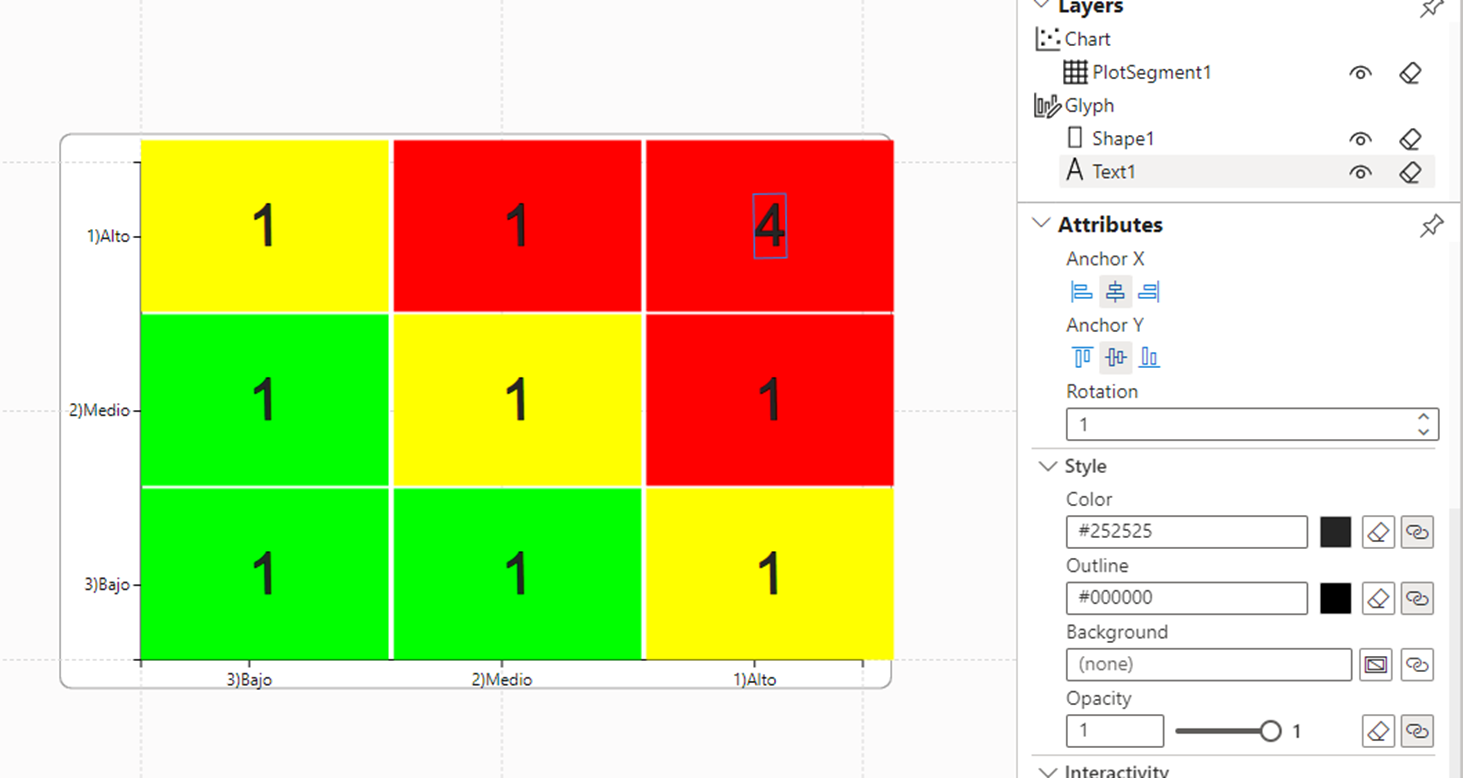
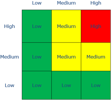
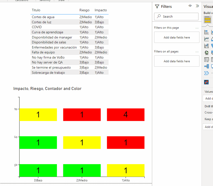
Imagine you have a list of risks and we have to create a chart like this.
We could use any of the following Power BI Visual:
-Table
-Matriz
-Plot
-Card(many):
Any approach works fine but the look and feel will be slightly different, just the card visual could give us the same design but It does not interact with other visuals.
Because of this we going to use charticulator in order to create a custom chart
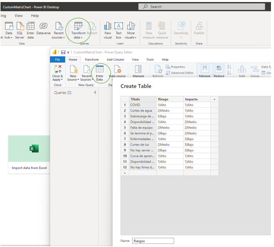
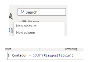
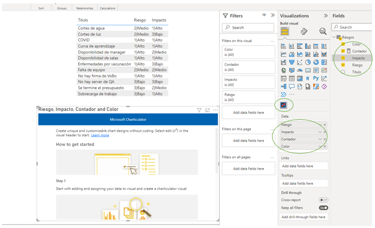
First of all we need to create a table data.
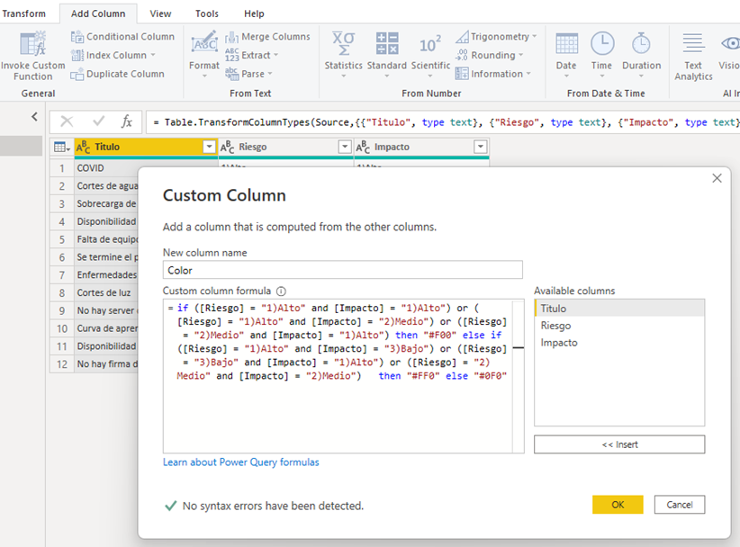
Add a custom column that be used to define background color.
And a Measure to count all items.
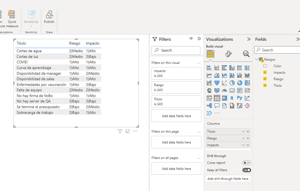
Now we can display the complete table.
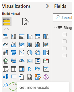
On visualization panel click on three dots menu option then ”Get more visuals”.
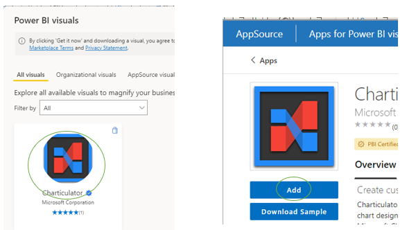
Use the search text box to get “Charticulator” visual , click on icon then Add.
Charticulator visual will be added , drag and drop this control into the report, configure columns to be use in this visual.
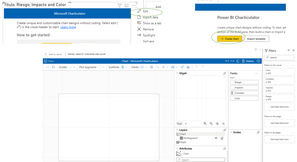
The next thing is to edit the Charticulator Visual.
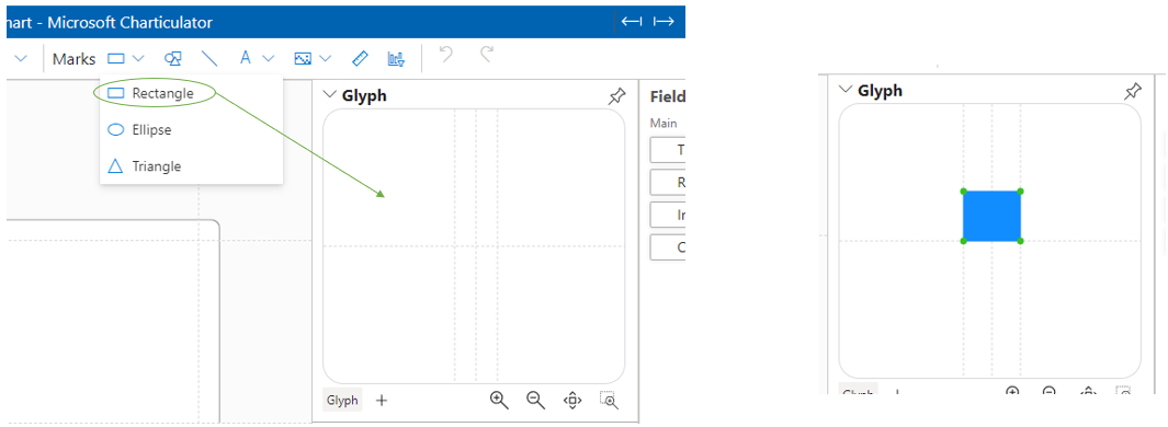
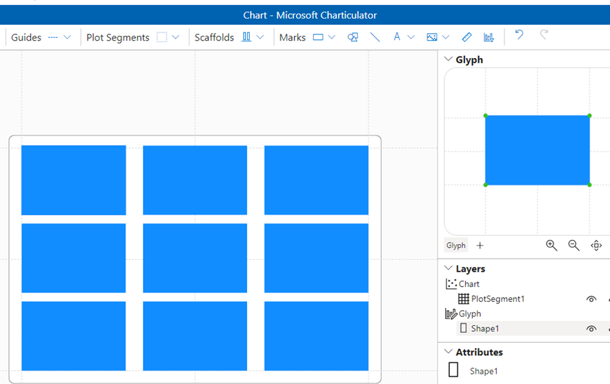
Add the “Rectangle” figure to Glyph area.
Click on main graph in order to display a menu then select Grid option.
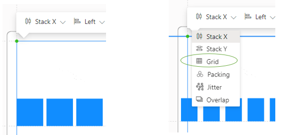
The graph will change to this.
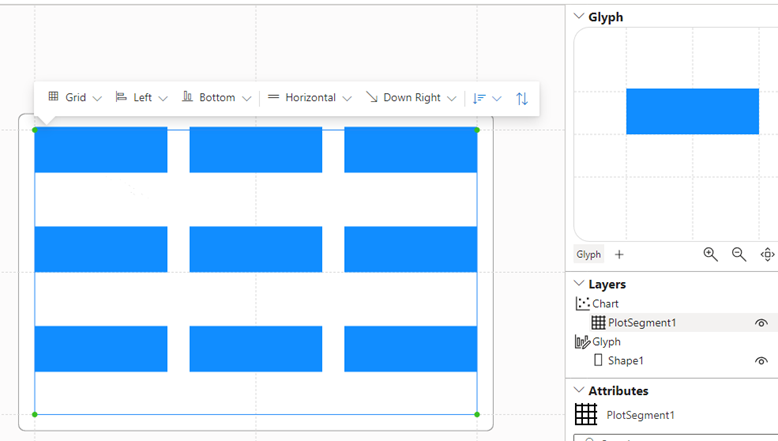
Use the corners on Glyph area to make square bigger.
Drag and Drop “Riesgo” column to Y AXIS and repeat with “Impacto” column to X AXIS.
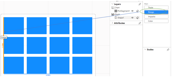
The graph will change to this.
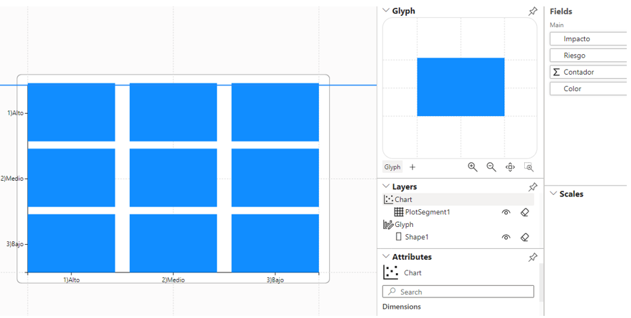
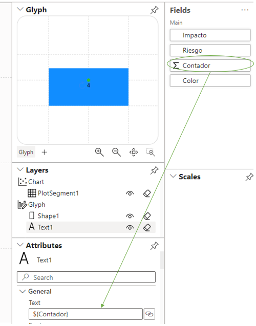
Add a text element to Glyph area.
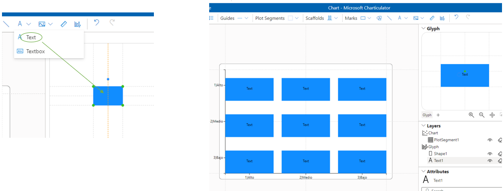
Drag and drop Contador field into input text and adjust the formula.
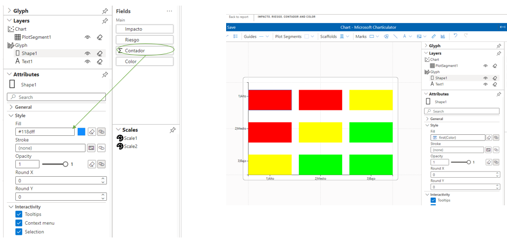
Select Shape1 element and drag and drop Color field to Fill input in Style section
In Order by click on Reverse
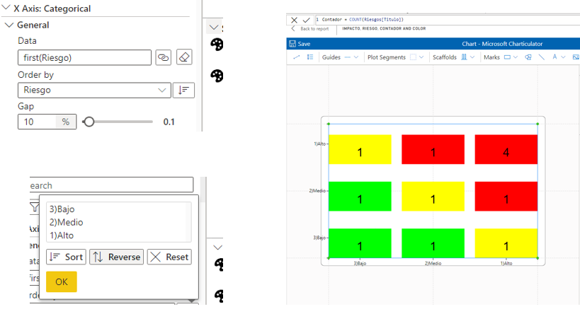
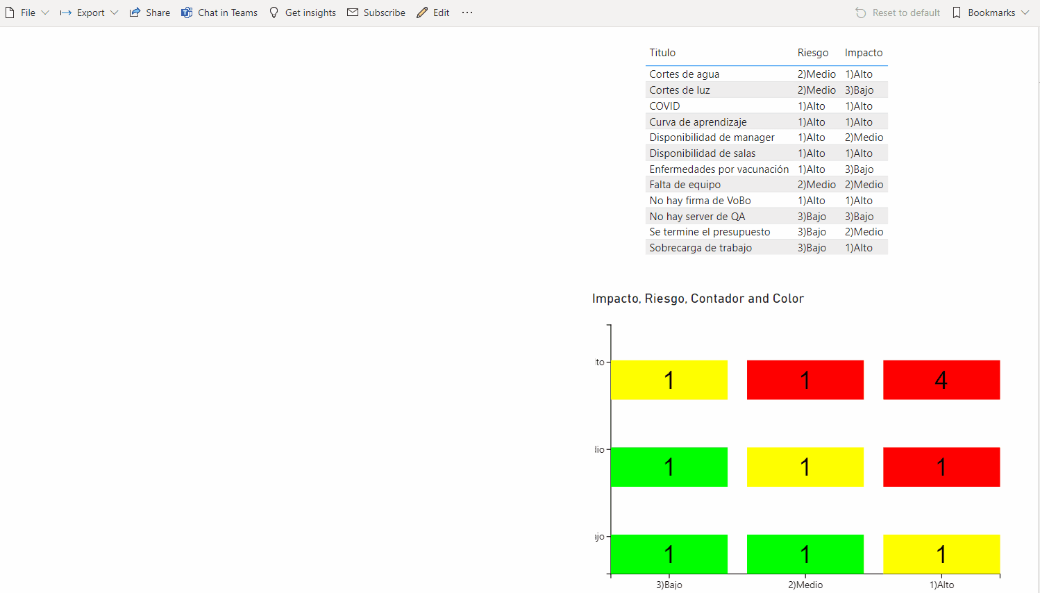
This is the final result
Since Charticulator is a certificated control the custom chart can be exported to PDF.
Finally we can use the style properties in order to adjust the size, color, fonts, etc.